Magazine Spread | Charisma


Brief
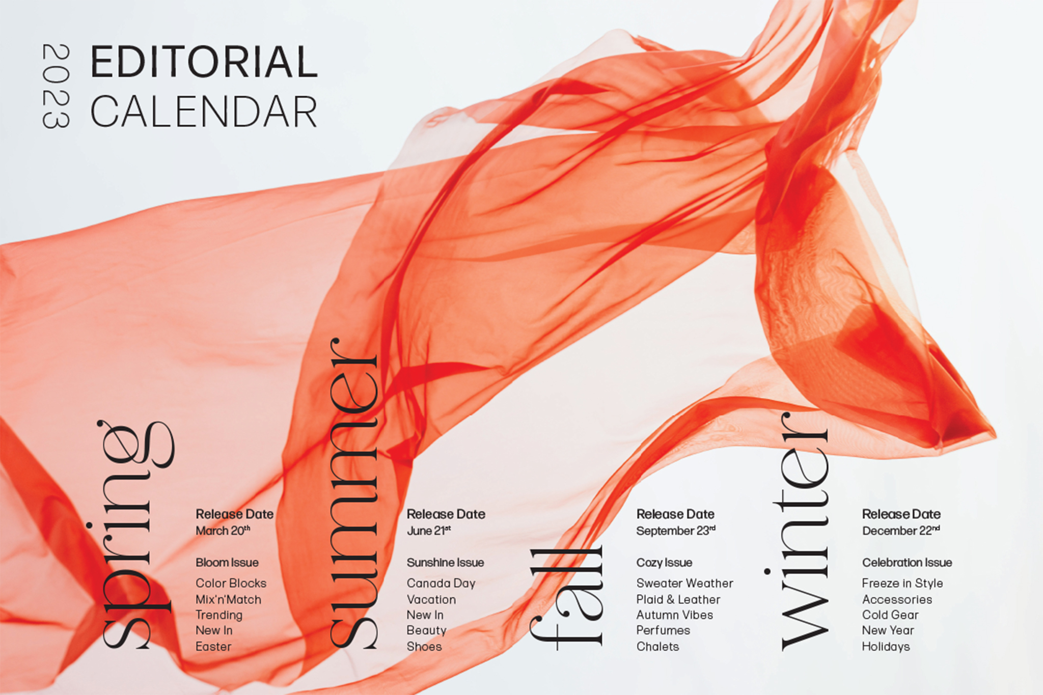
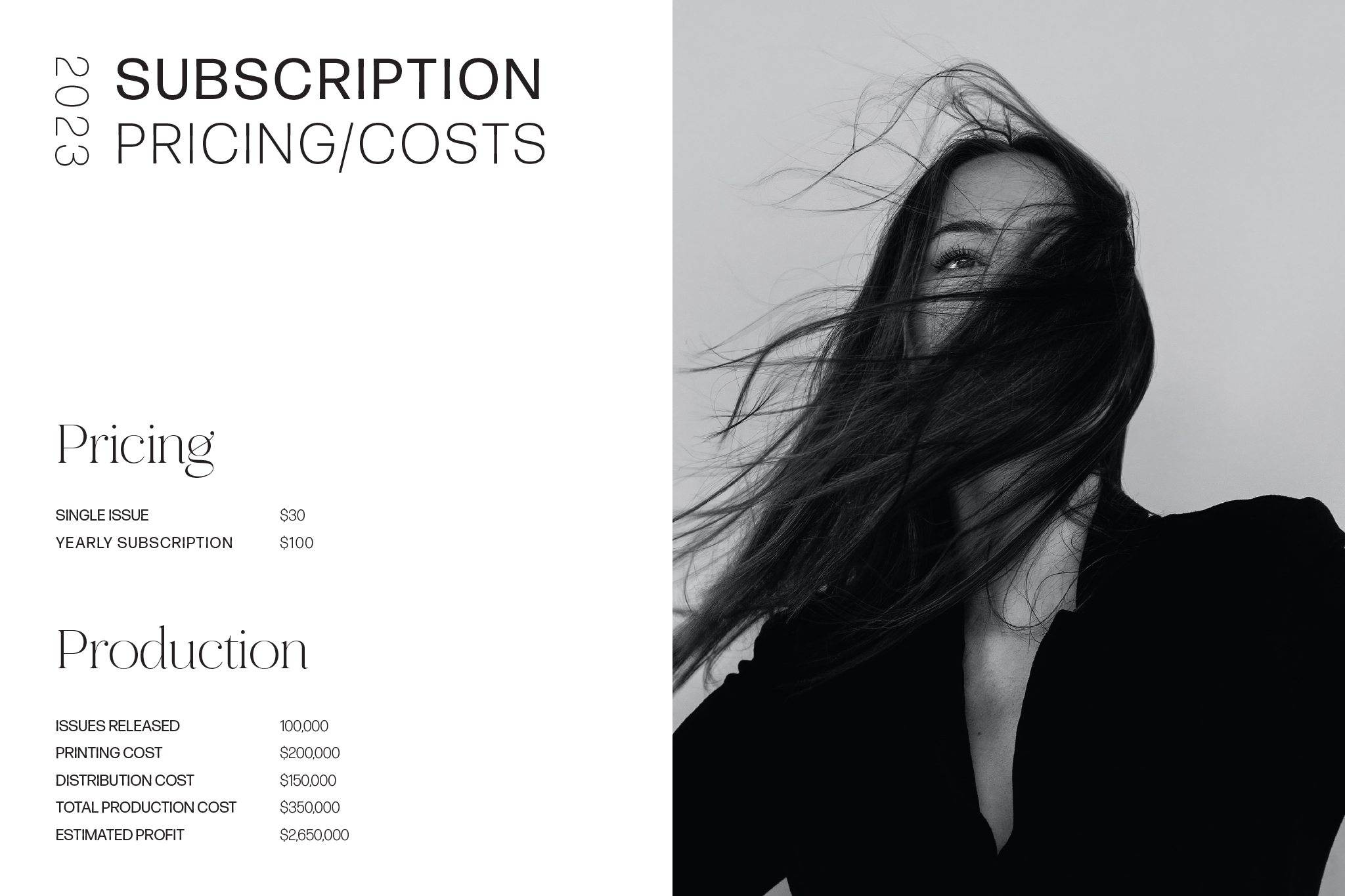
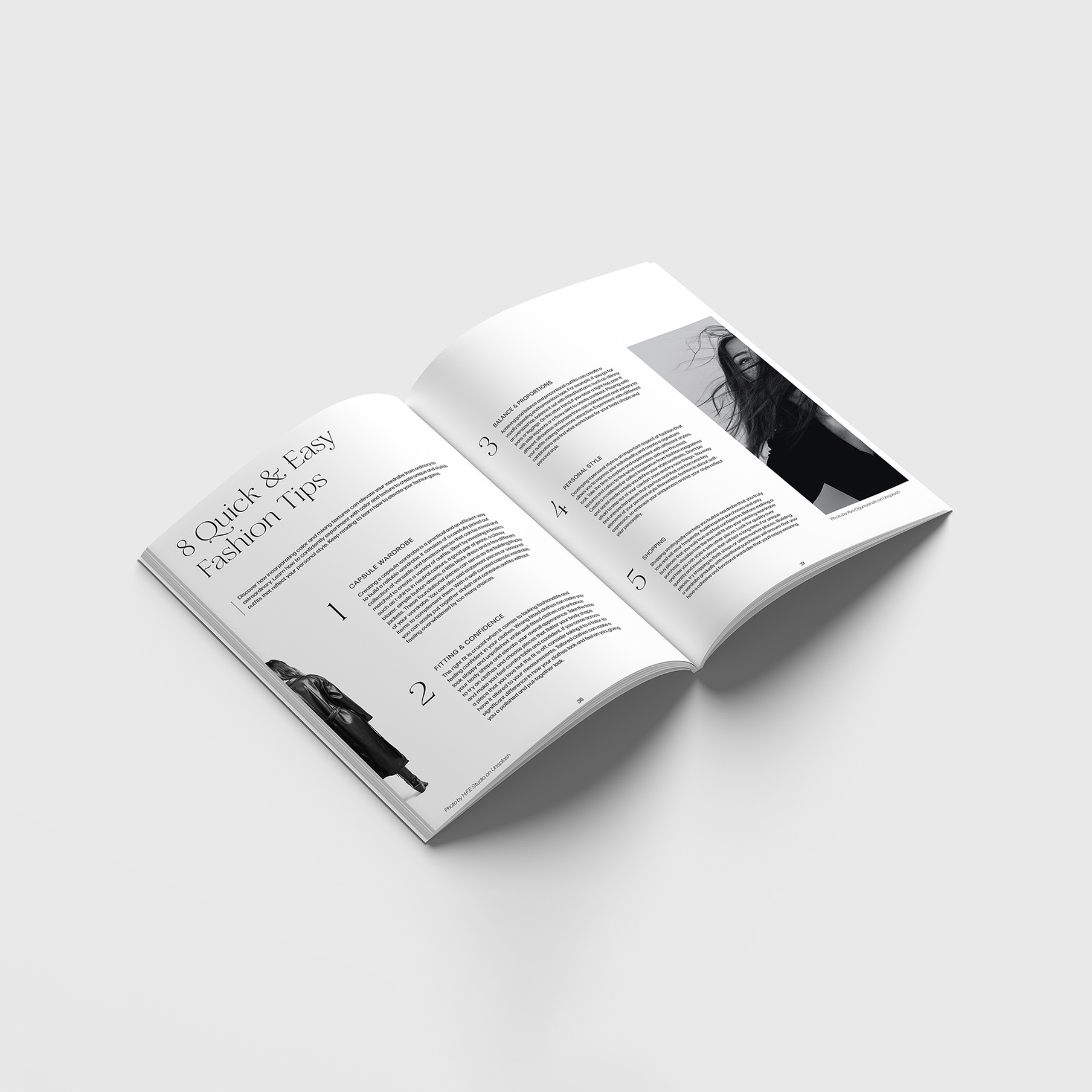
For this team project, we were asked to create a Montreal based magazine of our choice. My team decided on a Montreal based fashion magazine called CHARISMA. It primarly focused on images. For my article spread, I kept my design very minimal and clean by using big numbers and big images with an interesting layout. We also created a media kit for this magazine. I created a editorial calendar and a cost estimation page with a coral accent color which allowed every page to flow seamlessly once put together.
